Dispatch Log
Every update, upgrade, and improvement — straight from the lookout tower. The BOOM? Operator keeps watch so you don’t have to wonder alone.
Take Backs
At the end of September a boom came in from India. Two of us up in the tower tapped Me too on it by accident. Nobody here heard a boom from half a world away, so those taps had to go. Clearing them took a trip into the database by hand, and that’s no way to run a tower.
So the tower got rebuilt. Every boom is one tidy line now; tap it to open it up. Any tap that doesn’t belong — a stray Me too, a reaction, an upvote — can come off with one button. A boom filed from somewhere far off can get its place name fixed. Pulled booms go to a Trash bin instead of vanishing for good, so nothing is ever one wrong tap from gone. Every change lands in the log, and every change has an Undo. v2.4.0Tower v207d3daf 32eba3f · Oct 8, 2026
Operator actions in lib/tower.js, each logged with its exact reverse; POST /admin/undo. Soft delete via boom_reports.deleted_at (sql/005); every public read skips removed booms (checked by tools/qa/check-removed-filter.mjs). Remove/put back for Me toos, reactions, and upvotes; rename place; edit Operator posts; Hide replaces comment delete. Open/Solved/Trash/Activity tabs, 44px targets, 16px fields.
For BOOMers, two small things. Your Me too, reactions, and upvotes now stay lit when you come back to a boom, so you know you already said your piece. Tapping twice still counts once, same as always. And when a stray boom gets pulled, it drops off your map right away, no refresh needed. v2.4.0Lit taps + live removals91cf7e0 e73be99 · Oct 8, 2026
Boom page reads this connection’s taps on load. Me too recounts from boom_confirmations instead of +1; repeat reactions and upvotes no longer log. New public SSE event ‘removed’ drops pins and cards. Service worker v13 skips /admin.
Brighter Day
An old friend wrote in. Said BOOM? looked great, but his street was hard to see on the map. He likes dark mode, so a light theme wasn’t the answer. Just brighter streets, please.
So we swapped the base map for one with a brighter dark theme. Streets pop now. State borders show up. Forests and parks appear as subtle green patches across the country. Same dark mode feel, just no longer near-black ink on black paper. v2.3.1Brighter base map69bb04a · May 30, 2026
Tile provider swap: Carto Dark Matter to Stadia Alidade Smooth Dark. Four tile layers updated across views/boom.ejs, public/js/map.js, and public/js/report.js. Attribution added per Stadia TOS. Running on anonymous tier; can register an API key if traffic grows.
While we were in there, the historical event pins needed a touch-up to hold their own against the new lighter ground. Darker pin centers, brighter category-color borders, a thin halo around each one. Also caught a typo that had been hiding in plain sight: the Mystery pin’s “?” was using a fullwidth character that quietly pushed it off-center. Standard question mark now. Properly centered. Thanks, Ben. v2.3.1Pin polish + glyph fix69bb04a · May 30, 2026
.history-marker-icon background darkened, borders bumped to ~0.75 opacity per category, outer ring + drop shadow added. Mystery icon swapped from U+FF1F (fullwidth) to U+003F (standard) for visual centering.
Stamped and Filed
Every boom detail page now has a small file-tab in the top right showing the area name and date — FAIRVIEW HEIGHTS · MAY 23, 2026. It sits next to the BOOM? back button as the page’s identity anchor. The map looks the same on every boom; the tab tells you which one you’re actually looking at. Tap Prev or Next on the lane and the tab updates in lockstep. Each page feels like a specific record now instead of a generic detail view. v2.3.0Boom callsign tab14bdc16 · May 29, 2026
views/boom.ejs <header class="boom-header"> wraps back-link + .boom-ident; uppercase area + date with year; tooltip preserves full city,state; truncates “, ST” suffix on areas > 14 chars; flex-wraps on narrow viewports
The report card itself got restructured as an archival dispatch record. Header strip up top reads BOOM REPORT on the left and Filed Thu, May 28, 5:08 PM (yesterday) on the right, separated from the body by a thin rule. Below that: a clean list of labeled fields — WHERE, FROM, DISTANCE, OBSERVED — small-caps labels in their own column, values to the right. The BOOMer’s original notes come last in their own labeled excerpt block: FROM THE BOOMER over an italicized quote with a colored accent down the left. The information’s the same; it now reads like a slip out of a file cabinet instead of a card on a feed. v2.3.0Report-style boom-card14bdc16 · May 29, 2026
.report-stamp header strip with date + relative time; .report-fields dl with 5.5rem label column + dashed row dividers; .report-notes-block with border-left accent and small-caps label; preserves boom-distance JS wiring via field-row id
The whole interface got an edges-off pass to take the dashboard-y feeling down. Corners are noticeably rounder across the board. Hard outlines on buttons, cards, and panels softened into gentle translucent dividers. Every surface picks up a small top-edge highlight, a touch of bottom shadow, and a soft outer lift — little dimensional cues that make things feel like they have weight without going chunky-3D. The Post Comment button used to scream in solid red; it’s now an amber gradient with a subtle lift and dark text on warm orange. Pop without alarm. v2.3.0Soft-3D pass14bdc16 · May 29, 2026
:root tokens: --radius 8→14, --radius-soft 18, --border solid→rgba(255,255,255,0.06), --bevel-highlight, --bevel-shadow, --soft-lift, --soft-press, --lit-surface; .comment-submit rebuilt as linear-gradient(#d98a3a→#b87330) with #1a1410 text; same pass on .boom-card, .wh-link, .reaction-btn, .comment-form textarea
And one rule emerged along the way: drop shadow means tappable. Home report cards lift off the page (they’re links). Boom detail content panels — the report card, the BOOMer chatter section — stay grounded with their soft edges but no lift. Same visual feel, different job. You learn the rule in about two seconds and then your eye knows what’s interactive without having to think about it. v2.3.0Link vs content rule14bdc16 · May 29, 2026
--soft-lift drop shadow only on clickable surfaces (.report-card, .wh-link, .view-all-link); content panels (.boom-card, .comments-section) use bevel highlights without lift
The reactions row got stripped of its boxes. Five outlined buttons in a row read as a scoreboard, not an invitation. Now it’s an inline emoji bar: just icons and labels, with a soft tap-area on hover and a quiet color wash when someone reacts. The count tucks below the label so the active button doesn’t grow taller than its siblings. And when nobody’s reacted yet, the icons fade halfway and the “0” disappears entirely — the row reads as quiet options, not a tally of failures. v2.3.0Reactions emoji bar14bdc16 · May 29, 2026
.reaction-btn lost box/border/bevel; hover bg only; .reaction-btn[data-count="0"] mutes icon opacity to 0.5 and hides count via display:none; CSS order:1 on .reaction-count tucks it below the label; count picks up --reaction-color
Heat Signatures
Recent Reports cards needed to feel like somewhere, not just rows of data. They do now. Each card lights up with a colored glow anchored at the direction the boom came from — a south boom glows at the bottom edge, a northeast boom at the top-right corner. Cards with no reported direction get a centered glow with a bullseye dot in the corner widget: “right here, no specific bearing.” A small radar sits in the top-right of every card with concentric rings and a dot at the cardinal angle. Three or four scroll-throughs and your eye starts picking out the loud-from-the-southwest cards by their glow alone. v2.3.0Dimensional cards14bdc16 · May 29, 2026
Per-tier --tier-rgb token drives a focused 60px + 140px radial-gradient shockwave anchored via --shockwave-origin CSS prop; defaults to 50% 50% (bullseye) for direction-less cards; radar SVG with cardinal-direction dot in top-right corner
The five reactions got their own custom icons to replace the generic set. The standouts: scary is now a wire spike — a horizontal seismograph line with a sharp blip and a dot at the peak, directly nodding to the lookout-tower metaphor. curious is a radar locator with concentric rings and a center dot, echoing the corner widget on every card. loud is concentric ripple rings expanding from a center point — a boom propagating. The other two (the 8-ray boom burst for noway, the open-mouth laughing face for lol) stay distinct without trying too hard. v2.3.0BOOM-flavored reaction icons14bdc16 · May 29, 2026
Five custom inline SVGs in views/partials/reaction-icon.ejs; tier-tinted on engagement bar via currentColor + drop-shadow glow on intensity 8+; used by home, /archive, and boom detail reaction buttons
A blurb under Recent Reports invites the kind of community the wire wants more of: “Tap any boom to react, comment, or just say hi. The wire goes way back. BOOMers welcome from anywhere.” Cards with zero engagement show a soft “Drop a line, BOOMer →” prompt instead of an empty engagement bar. The What’s Happening panel up top got its own short blurb. And the archive page used to be a barren list — same cards as Home, stripped of glow, radar, and identity. Now it uses the exact same card style as Home, pulsing with the same heat signatures. Each archive view (Open / Solved / All) gets its own short note from the lookout, too. v2.3.0Engagement copy + archive parity14bdc16 · May 29, 2026
views/partials/report-card.ejs shared by home + archive; .section-blurb class with inline archive link; .card-engagement--empty + .empty-cta on cards without reactions/comments/me-toos; status-aware h1 + blurb on /archive (open / solved / default)
The Wire
The home page got a new layer between the live mini-map and Recent Reports — a panel called What’s Happening. Two halves. Latest Answers stacks the most recently SOLVED booms with the Operator’s call sitting right there as a pull-quote — no need to tap through to find out what it was. Active Discussions is the louder half: every unresolved boom that has chatter on it, lined up in a horizontal lane you can swipe through. As of tonight, that’s thirty-nine booms with conversations still alive on them. v2.3.0What’s Happening panel12cbe3c · May 29, 2026
LATERAL JOIN pulls each discussion’s latest comment; counts via grouped subquery; separate query for “true totals” chips
Each card in the lane reads like a feed entry. Intensity number top-left, city up top, the most recent comment quoted in italics, and the BOOMer who said it tagged below with a colored dot — same identity scheme that’s lived on the boom detail pages. If the Operator chimed in last, you get a THE OPERATOR badge in red instead. A tidy stats bar at the bottom of the card shows how many BOOMers are chiming in and how many heard it. Cards with comments inside the last hour get a small green pulse next to the timestamp — that’s the “live now” signal. v2.3.0Social-feed cards12cbe3c · May 29, 2026
Pull-quote with 3-line clamp; BOOMer dot derived from ip_hash hex slice + HSL hue; engagement bar with chat/heard-it SVG icons
The section header reads the room. Quiet hour with nothing going on? It says “Quiet on the wire.” Mid-day with a couple things in motion? “What’s Happening.” Four or more recent events? “Busy on the lookout.” And the moment a boom gets resolved while you’re sitting on the page, the header briefly flips to “Mystery just cracked” in green for twenty-five seconds before settling back to its calm state. The whole panel updates live, too — new booms, new comments, and new resolves all slide their cards into the lane without a refresh. A little dot next to the header blips on every event so you can see the wire is awake. v2.3.0State-aware header + typed SSE12cbe3c · May 29, 2026
Server picks header text from boom_activity COUNT over last hour; SSE messages are now typed {report|comment|resolved}; client routes by type to header swaps + card mutations
On a phone, the lane is built for one-handed thumb scrolling. Each card snaps to the center of the viewport with a sliver of the previous and next card peeking on either side — you always know there’s more to swipe to, and the active card is always fully framed. On a first visit the lane does the same little double-bounce the histogram does over on /map: it nudges right, comes back, nudges right again, settles. Once you swipe it yourself, the nudge is retired forever. v2.3.0Mobile center-snap + bounce-peek12cbe3c · May 29, 2026
scroll-snap-align:center on phones with cards at 76vw / max 300px; four-step scrollTo bounce with scroll-snap-type briefly lifted; sessionStorage-gated, prefers-reduced-motion respected
And while we were in there, a couple of tone shifts. The word theory got swapped for chiming in across the panel — the wire isn’t just for detective work. Sometimes you just want to say “wait, that one was loud, anyone else?” The comment box on each boom detail page picked up a new prompt to match: “Heard it too? Got a guess? Drop a line, BOOMer…” Discussions, not depositions. v2.3.0Tone rebalance12cbe3c · May 29, 2026
“theory”/“theories” replaced with “chiming in” across labels and section copy; comment textarea placeholder reworded to invite all engagement modes
One more thing to round out the wire: continuity. Tap any card on the home panel and the lane quietly remembers where you were. When you come back — whether by the back button or the “← BOOM?” link — the lane lands on the same card you tapped, with a peek of its neighbors on either side. No more re-swiping through thirty-eight cards to find your spot. And while you’re inside the boom detail, a small nav bar up top shows where you are in the thread — Prev · Active Discussions, 5 of 39 · Next — so you can thumb forward through the discussions without bouncing back to home every time. Fewer dead ends, both ways. v2.3.0Lane continuity12cbe3c · May 29, 2026
sessionStorage stores clicked report_id per lane; on home reload the target card is centered via offsetLeft math (robust to SSE-prepended cards); boom detail accepts ?from=disc|answers and runs LAG/LEAD window queries over the same ordering for prev_id/next_id + pos/total
City Up Top
One more bit of polish before signing off for the night. The popup that appears when you tap a pin on the live map now shows the city at the top of the card — bolded, dark, matching the boom detail page. Where first, then how loud. v2.2.2City on live-map popupc550be5 · May 27, 2026
/api/reports joins city + state and runs formatArea() server-side; .popup-area heading in the addMarker popup
Closer In
After 2.2.0 went out, we kept tinkering. A handful of small things that make the app feel more personal, more local, and more alive — none big enough to be their own headline, but they add up.
The “Share this boom” text link at the bottom of a live-map popup was selling the detail page short. The link already went to the boom’s detail page, where you can react, comment, share, and check who else heard it — the label just hinted at the share action. We turned the text link into a real button: “Open this boom →” with a smaller line below reading “react · comment · share.” Same destination, much clearer affordance. v2.2.1Live-map popup CTA5c4269e · May 27, 2026
Button-style .boom-popup-cta with hover lift + secondary action subtitle
Boom detail pages now show the city right under the intensity number, in the same bolded style the home cards use. The OG description for social-share previews picked it up too — “Okay that was real in Fairview Heights — from SW” reads a lot better than “Okay that was real — from SW.” v2.2.1City on boom detailc073e35 · May 27, 2026
formatArea(report.city, ...) wired into the detail render; OG description gains an “in <city>” clause
Same detail page: a relative-time badge now sits right next to the absolute timestamp — “Sat, May 23, 9:04 PM (3 days ago).” And if you’ve granted location access, a third line in the meta reads “about 4.5 mi from you,” computed between your fuzzed location and the boom’s fuzzed location. Both points are snapped to the same ~200m grid, so the distance is honest about its precision — under 0.1 mi we just say “very close to you” instead of pretending we know to the foot. v2.2.1Time-ago + distance3071ff1 · May 27, 2026
relativeTime() helper for past-24h ranges; Haversine on fuzzed coords; hidden until locationfound
The pulsing blue “you are here” dot — which has lived on the /map page since v1.8 and on the boom detail mini-map since this morning — now also lives on the home mini-map. The home page was the one place it wasn’t. Not anymore. v2.2.1Blue dot on homeb5dc206 · May 27, 2026
placeUserMarker() in report.js with race-safe init/locationfound ordering
And when a new boom comes in while you’re sitting on the home page, the Recent Reports list now updates in real time. The new card slides in at the top with a pulsing green “Just in” badge, the oldest card drops off, the pin drops onto the mini-map, the count ticks up. The home page is officially a live radar. v2.2.1Live Recent Reports6ce213e · May 27, 2026
prependLiveReportCard from SSE handler, cap-5, escapeHtml on notes, slide-in animation
Polish Before Push
Before sending this whole batch out the door, we ran it through a review pass. Twice. The first time to catch anything the build missed; the second time to pressure-test what came out of the first pass. The second look caught a thing the first one had mis-categorized as “dormant.” It wasn’t. Tapping a bar in the All view was about to fire a SQL query that drifted across daylight-saving boundaries by an hour. Quietly. Fixed before anyone hit it. v2.2.0DST-safe bucket queryf7869c4 · May 27, 2026
make_interval(weeks := 1) instead of INTERVAL '1 week', whitelisted via unitFieldMap
A few more things while we were in there. The histogram bars now refresh after you clear a filter — previously, any booms that arrived while you were filtered down to one day were missing from the bars when you went back to the full window. The bars and the map are back in sync. v2.2.0Histogram refresh on clearf7869c4 · May 27, 2026
loadHistogram(activeMinutes) added to clear-filter handler
The clear-filter pill got a subtle amber wash so it actually reads as clickable instead of looking like another piece of text. The hour-bucket tooltip now ends with “CT” so a BOOMer checking the app from somewhere outside Central time knows exactly what hour we’re talking about. And the service worker cache got bumped from v8 to v9 so old phones don’t keep showing the old version of the app while the new one quietly sits in their cache. v2.2.0UX + cache cleanupf7869c4 · May 27, 2026
Amber .hist-clear-filter, CT suffix on hour tooltips, SW cache boom-v9
Sometimes the polish is the feature.
The Wheel
The histogram works fine on a laptop. Fifty-two weekly bars across a wide browser is breezy. On a phone, fifty-two bars across a 393-pixel viewport is seven pixels per bar. Impossible to tap. So on phones, the strip turns into something different: a picker wheel. v2.2.0Mobile horizontal scroll14fdf27 a9ee158 · May 27, 2026
Touch-aware media query (max-width 900px / pointer:coarse / hover:none); flex spacers for runway
On a touchscreen, the strip becomes scrollable. Bars get fattened up to 36 pixels wide, taller too — real tap targets. Empty space runs out on both sides so the very first bar and the very last bar can each be scrolled to the dead center of the viewport. A thin amber line down the middle of the strip marks the focal point: whatever’s under that line is what you’re looking at. v2.2.0Lens + needle14fdf27 · May 27, 2026
SVG-attribute-driven magnification on bars + axis ticks, pseudo-element center indicator
And the bars themselves do something. Whichever bar is closest to the needle stays at full size and full color. Bars further from the center scale down, fade, and pull toward the focus — like the surface is bending around the lens. Swipe and the wheel rolls past; whatever’s in front of you is sharp, whatever’s at the edges is implied. The axis labels do the same thing — “Mar” reads big and clear under the focal point, “Aug” eight bars to the left shrinks and dims like it’s in the distance. v2.2.0Picker-wheel magnification14fdf27 · May 27, 2026
Per-element scale + shift + opacity by distance from viewport center, rAF-driven
On your first visit on a phone, the strip will do a small wiggle to let you know it’s scrollable. It nudges right and back, twice, then sits still. Once you swipe it yourself, the nudges stop forever — we’re not going to bother people who already get it. v2.2.0Peek animation14fdf27 · May 27, 2026
Double-nudge sessionStorage-gated, suppressed by prefers-reduced-motion
Also: the filter button labels got shorter on phones. “30 min” is now “30m”; “24 hr” is “24h.” Same idea, half the pixels. Now all seven buttons plus the Live badge fit on one line on an iPhone in portrait. v2.2.0Compact filter labelsa8260e3 · May 27, 2026
30m / 1h / 6h / 24h / 7d / 30d / All format
The Timeline
The map used to cap at twenty-four hours. Useful for “what just happened?” — less useful for “wait, was last Thursday weirdly loud, or am I imagining things?” So we added three new filter buttons: 7 d, 30 d, and All. That last one goes back a full year. v2.2.0Longer time windows5159b2b · May 27, 2026
7d / 30d / All-year filter buttons; cap raised from 24h to 525,600 min
And right under the filter row: a new histogram strip. A thin row of amber bars, one per bucket. At 24 hours, each bar is an hour. At 7 days, each bar is a day. At All, each bar is a week. Hover any bar — or tap, on a phone — and a card pops up with the bucket’s date, how many booms landed in it, and the average intensity. “Sunday, May 3. 1 boom · avg 5/10.” v2.2.0Histogram strip + tooltip5159b2b · May 27, 2026
/api/histogram with TZ-aware buckets, avg intensity, Tower-styled hover card
The whole thing is also a clicker. Tap “View on map →” in the hover card and the map filters down to just that bucket’s booms — pins, intensity colors and all — and pans over to wherever those reports happened. A pill appears in the meta line: “Showing 12 booms from Wednesday, May 21 × clear.” Tap clear and you’re back to the full window. v2.2.0Click bar to filter map5159b2b 1338262 · May 27, 2026
bucket+unit params on /api/reports, flyToBounds animation, SSE paused while filtered
The map view changes are animated now — instead of snapping to the new bounds, it eases in over six-tenths of a second. Small thing, but the difference between a busted-feeling GPS and an actual chart you can scrub is mostly that.
Karl Grable nudged us toward this back when he asked about “analytics over time” — counting things, looking at patterns. Thanks again, Karl.
Find Yourself, Wherever
The pulsing blue dot that lives on the main map has been making fewer appearances than it should. It was always there on /map — you, in real time, relative to the booms. But on the individual boom pages? The mini-map showed where the boom happened, full stop. You had to imagine where you were standing in relation to it. Not anymore. The blue dot now follows you to every boom detail page, and the mini-map auto-fits to show you and the boom together, at whatever zoom level makes that work. Two blocks away looks like two blocks; two towns over looks like two towns. v2.2.0Blue dot on boom detail07bc224 · May 27, 2026
Pulsing geolocation marker on per-boom mini-map, auto-fit to both points
One small thing under the hood: your blue dot is snapped to the same ~200m grid that the boom pins use. Same precision, same privacy floor. If a boom pin can’t pinpoint someone’s house, neither should yours — even just on your own screen. v2.2.0User-location fuzz07bc224 · May 27, 2026
geo-fuzz.js: ~200m grid snap matching lib/fuzz.js cell size
Locked In
If you’ve ever tapped the comment box on a boom page and watched the whole screen zoom in and break, that’s fixed. iOS has this “helpful” behavior where it auto-zooms on any input field with a font size under 16px. The comment textarea was at 14.4px. The viewport had no cap. So when you focused the field, the browser zoomed in and never came back. Now the viewport is locked at 1x, the comment field is at 16px, and the whole thing stays put. v2.1.2Viewport zoom lock75913af · Mar 7, 2026
maximum-scale=1.0, textarea font-size bump to 1rem
While we were in there, we added a portrait orientation hint to the manifest for Android devices that install the PWA. iOS does its own thing and ignores it, but on Android it’ll keep the app upright where it belongs. v2.1.2Portrait orientation (Android)75913af · Mar 7, 2026
manifest.json orientation: portrait
Also: pull-to-refresh now works on every page. It was already on the home page and the archive, but the boom detail pages — where you actually want to refresh while waiting for new comments — didn’t have it. Neither did About, Dispatches, or Local History. Now they all support it. Drag down from the top and it reloads. On boom pages, the map won’t trigger it either; Leaflet touches are excluded so you can pan without accidentally refreshing. v2.1.2Pull-to-refresh everywhereb67f033 0453b8e · Mar 7, 2026
pull-refresh.js on boom, about, dispatches, history; Leaflet touch guard
The Tower
The place where the Operator works got a name and a complete rebuild. Welcome to The Tower. v2.1The Tower dashboardc0d39e8 · Mar 5, 2026
Stats bar, filters, pagination, “The Tower” rename
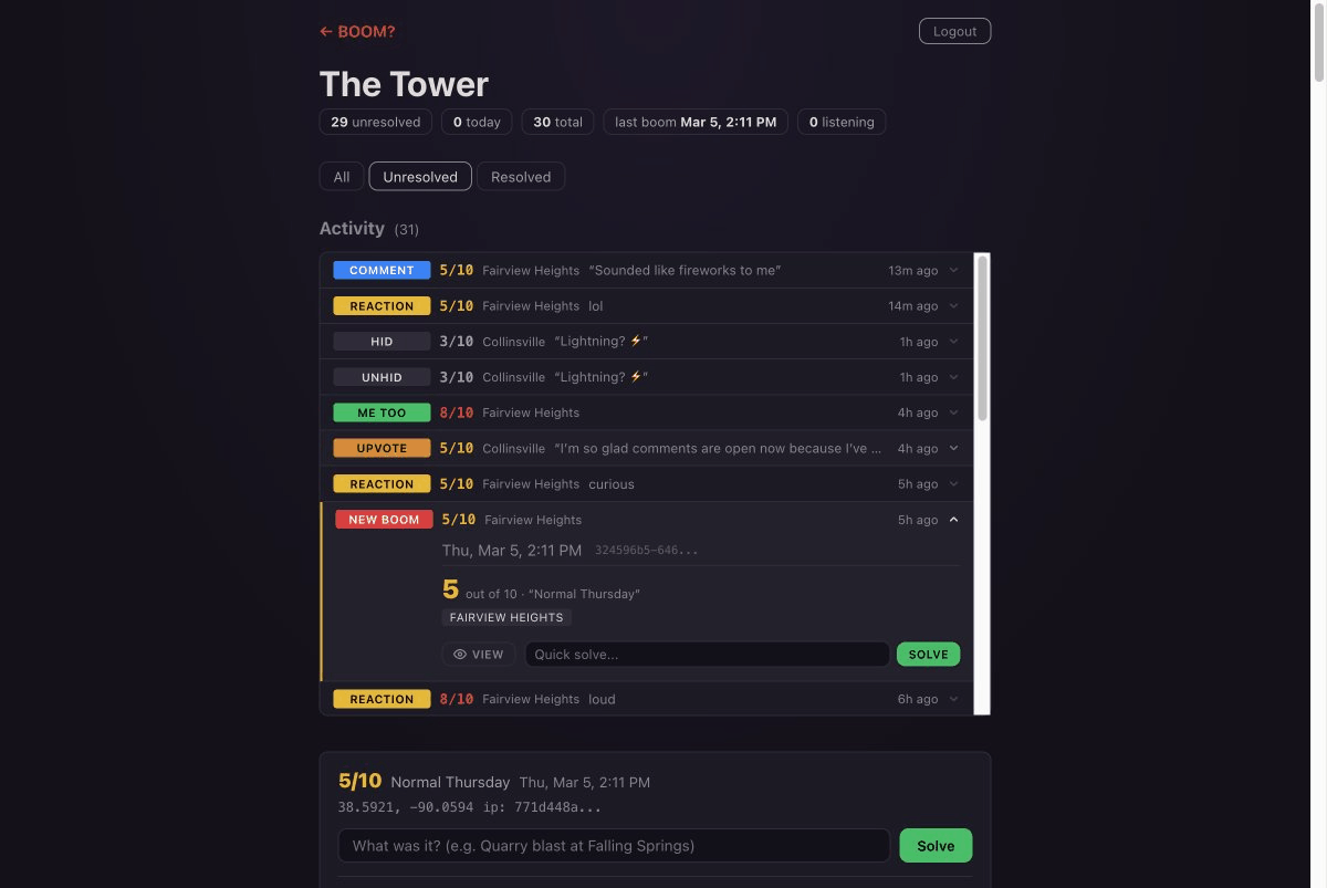
Open it up and the first thing you see is the stat bar: how many booms are unresolved, how many came in today, how many total, when the last one hit, and how many BOOMers are listening right now on the live map. Below that, three filter tabs — All, Unresolved, Resolved — so you can focus on what needs attention.
But the real thing is the Activity feed. Every single event — new booms, comments, reactions, upvotes, confirmations, moderation actions — shows up as a compact row with a color-coded badge, the intensity, the city name, and a preview. Click any row and it opens up with everything: the full intensity label, direction, flash and rumble tags, notes, resolution status. All right there. No clicking through to another page. v2.1Expandable Activity feed76595af · Mar 5, 2026
Accordion rows, 3-JOIN enrichment, quick-action buttons
And each row has buttons that match the situation. See a comment that shouldn’t be there? Hide. A great theory from a BOOMer? Pin it. A new boom you already know the answer to? Type the explanation and hit Solve, right from the feed. One panel, every tool. v2.1Contextual quick actions76595af · Mar 5, 2026
View, Hide, Pin, Solve, Unhide, Unpin — per action type
Here’s the part that changes everything: the feed is live. Not “refresh to check for updates” live. Actually live. A BOOMer drops a reaction in Fairview Heights and it slides into the top of the feed within a second. A comment lands in Collinsville and it’s there, ready to read and moderate, before the commenter has even closed their phone. The Operator sees it all the moment it happens. v2.1Live SSE Activity feed484b79e · Mar 5, 2026
Admin SSE channel, client-side HTML builder, slide-in animation
Also in the mix: pin and unpin comments, delete your own Operator messages, edit a resolution after you’ve already posted it, unhide things you hid by mistake. The kind of stuff you don’t miss until you’re moderating at 11 PM and something goes sideways. v2.1Moderation toolkitcdda634–41311fb · Mar 5, 2026
9 commits: security, filters, pin/unpin, edit resolve, delete ops
One more thing. The BOOM? Operator position is getting a new set of hands. The original Operator built the tower, wired it up, and made sure everything worked. Now it’s time to hand over the watch. A new Operator is stepping up — younger, sharper, and ready to run this thing. The tower is his now.
Metro East, you’re in good hands.
The Operator Has a Voice
Until now, the Operator was a ghost. Could see everything, moderate everything, but couldn’t say a word to the community. That quarry blast at Falling Springs? The Operator knew what it was but had no way to tell anyone except through the SOLVED badge. Not anymore. v2.0Operator comments9e29683 · Mar 4, 2026
is_operator flag, THE OPERATOR badge, admin post form
Now the Operator can drop into any boom’s comment thread with a distinctive red badge: “THE OPERATOR.” No anonymous hex tag, no colored dot. Just the voice from the tower, cutting through the chatter with the answer. “That was a controlled demolition on Route 157.” “Transformer blew on Main Street — Ameren is on it.” The kind of answers that end the guessing.
Behind the scenes, the whole admin experience got rebuilt from scratch. The old setup involved pasting a secret key into the URL bar like it was 2004. Now there’s a proper login page, a session cookie that lasts a week, and a dashboard with a live activity feed — every report, comment, reaction, and confirmation scrolling by in real time, color-coded and timestamped. The Operator finally knows what’s happening without refreshing an inbox. v2.0Admin console + activity feed9e29683 · Mar 4, 2026
express-session auth, boom_activity table, scrollable feed
Best part: when the Operator is logged in and browsing the public site — checking a report, reading the archive — admin controls appear right there. A small gear icon on every card. Solve and Delete buttons on detail pages. A Hide button on any comment, including the Operator’s own mistakes. No more bouncing between the dashboard and the public pages to moderate. It all happens in place. v2.0Inline admin controls1310127 ff0b045 · Mar 4, 2026
Admin toolbar on detail, gear icon on cards, hide on all comments
Oh, and double-submit protection. If you accidentally hit the button twice (we’ve all been there), the second post gets silently swallowed within a one-minute window. No duplicate Operator messages. No duplicate BOOMer comments either. v2.0Duplicate comment guard4d4dbf8 · Mar 4, 2026
1-min dupe check on all comment inserts
Every Card, Reconsidered
The report cards — the things you see on the home page and the archive — were bugging us. Not broken, just... cluttered. Intensity number, area name, timestamp, direction, badges, engagement stats, all jammed into one row fighting for your eyes. If you have any kind of attention issue, good luck scanning a list of those. So we tore them apart and put them back together. v2.0Grid card layout1310127 · Mar 4, 2026
CSS Grid: intensity column + stacked content body
Now the intensity number sits in its own column on the left — big, bold, colored by severity. Your eye hits the number first, then slides right to the area name in bold (Collinsville, Belleville, Mascoutah), then down to the timestamp and direction. Notes sit on their own line with room to breathe. Engagement stats underneath. Everything has a place and nothing is competing.
The numbers themselves tell you more than they used to. A gray “2” barely registers. A yellow “5” gets your attention. An orange “7” says something serious happened. And a glowing red “10” — with a subtle red wash across the entire card — says get in here. Five tiers, no generic colored borders, just the number doing its job. v2.05-tier intensity system1310127 · Mar 4, 2026
Gray/yellow/orange/red/glow, background tint for 8+
Timestamps got the full treatment. Every card now reads like the clock on your Mac: “Wed Mar 4, 12:15 AM.” No more “20h ago” with no time of day. No more mystery compass letters either — “N” became “from N.” Small word, big difference. And “3 confirmed” turned into “3 heard it,” because that’s what actually happened. v2.0Timestamp + language72478a2 edb624e · Mar 4, 2026
Full date+time, “from N”, “heard it”
Under the hood, a contrast audit fixed several spots where text was technically visible but practically invisible on the dark background. The reaction buttons on boom detail pages each got their own accent color — amber, gold, red, blue, orange — so they actually pop instead of fading into the surface. Area names got smarter too: the city-matching radius went from 6 miles to 15, which means reports between cities actually get a label now instead of showing up blank. v2.0Contrast + reactions + areas1310127 · Mar 4, 2026
WCAG fixes, per-reaction colors, wider nearestArea threshold
Find Yourself on the Map
Open the full map now and you’ll see a pulsing blue dot. That’s you. Sounds obvious — every map app does this — but BOOM? didn’t have it until now, and it makes a huge difference when you’re trying to figure out whether that boom was two blocks away or two towns over. v1.8Blue “you are here” dot7a3bcf0 · Mar 4, 2026
Pulsing geolocation marker on live map
Each boom’s detail page also got its own mini-map. Tap “Show on map” and it unfolds right there, showing you exactly where the report came from. No need to jump to the full map and hunt for the right dot. v1.8Detail page map4b4900f · Mar 4, 2026
Expandable per-report map with unified marker colors
And for the folks whose browsers won’t share their location (or who’d rather not), the report form now shows a tappable map when geolocation fails. Place your pin manually, anywhere in the Metro East. No GPS required, no boom goes unreported. v1.8Location picker fallback3b675e0 · Mar 4, 2026
Tap-to-place map when geolocation is denied or unavailable
The whole interface also got a subtle warmth pass — cooler blues shifted warmer, form fields tightened up, the submit button got smoother. Nothing you’d point at and say “that changed,” but it all feels a little easier at midnight when something wakes you up and you reach for your phone. v1.8Warm palette + form polish36d6829 · Mar 4, 2026
Warmer color variables, refined inputs and buttons
Also in the mix: a one-tap “Install BOOM?” button on browsers that support it, and some behind-the-scenes SEO work so search engines can find us when someone Googles “what was that boom in Collinsville.” v1.8PWA install + SEOa634170 8202beb · Mar 4, 2026
beforeinstallprompt handler, canonical tags, JSON-LD schema
Your Map, Your Neighborhood
Small but important one. The mini-map on the home page used to always load centered on Collinsville — fine if you live there, less useful if you’re in Belleville or Granite City or out near O’Fallon. Now when you open BOOM?, the map quietly asks for your location and pans to your actual neighborhood. If you’ve already granted location access, it happens before you even notice. v1.7.2Mini-map geolocationc5615ae · Mar 2, 2026
Map centers on user GPS (zoom 12), falls back to Collinsville
If location isn’t available — denied, timed out, whatever — it falls back to the same Collinsville view as before. No error, no prompt. Just the map you’d expect to see.
BOOMer Chatter
Boom pages used to be dead ends — you’d tap “I heard it too,” maybe share it, and that was it. Not anymore. Every report now has a row of five emoji reactions: No Way, Funny, Scary, Curious, and Loud. Tap one and the count ticks up instantly. Below that: a comments section where fellow BOOMers can drop theories about what caused the boom. “Know what it was? Drop your theory, BOOMer...” Comments get thumbs-up votes so the best guesses rise to the top. All anonymous, all rate-limited, all profanity-filtered. Zero friction — just like reporting. v1.7.0Reactions + comments + upvotesd404f2b · Mar 1, 2026
5 emoji reactions, anonymous comments, thumbs-up voting
Every commenter gets a deterministic identity — a colored dot and a hex tag like “BOOMer #72E” — derived from their connection. Same person, same tag, same color. You can tell when the same BOOMer is dropping multiple theories. No accounts, no sign-ups. Just vibes and hash functions. v1.7.0BOOMer identity928b9d7 · Mar 1, 2026
Deterministic hex tag + HSL avatar from IP hash
And when the mystery is solved? The Operator can mark any boom with a green “SOLVED” badge and an explanation that pins above everything else. Quarry blast, transformer pop, fireworks — now the community knows. Solved booms show the badge on the home page and archive too. The Operator can also hide comments that don’t belong. v1.7.0Solved badge + moderationd404f2b · Mar 1, 2026
Admin resolve/unresolve, hide comments, public SOLVED banner
Credit where it’s due: this whole feature traces back to Karl Grable, who back at v1.4.0 nudged us toward “letting people interact with individual booms.” That was the seed. Reactions, comments, upvotes, BOOMer identity — it all grew from that one push. Thanks, Karl.
Post-deploy footnote: the BOOMer dot and new formatting looked great on desktop but refused to show up on mobile. Took three commits to sort it out. The service worker was caching a bare CSS path while the HTML requested a versioned one — different URLs, stale styles. Then Safari’s HTTP cache was holding onto the old service worker script itself for up to an hour, so the fix never arrived. We added no-cache headers for the SW file, versioned the registration URL, and bumped to 1.7.1. Sometimes shipping the feature is the easy part. v1.7.1Mobile cache fixa364229 d2254d1 b68e05d · Mar 1, 2026
3 commits to beat Safari’s cache: no-cache SW headers, versioned registration, CSS bust
Timestamped
When the map is showing booms from the last 24 hours, you need to know which ones just happened and which ones are from yesterday. Now every live boom pin wears a small time label underneath — “9:26 PM” for today’s reports, “Fri 10:04 PM” for anything older. Tap a pin and the popup card shows the full date too. No more guessing. v1.6.7Marker time labelsd5a4154 · Mar 1, 2026
Permanent tooltip + full date in popup cards
The Map Remembers
The BOOM? map just got a memory. Twenty verified historical events now live on the map as muted gray markers — earthquakes, demolitions, industrial explosions, mystery booms, even a UFO sighting. Tap any one and you get an Operator-narrated card with the full story, intensity rating, and source. The New Madrid earthquakes of 1811. The Checkerdome implosion. That mystery boom last December that nobody could explain. It’s all there. v1.6.0Historical boom markers0a8f16b · Feb 28, 2026
20 events, map layer, popup cards, /api/historical
There’s also a new Local History page where you can browse every event, filter by category, and jump straight to any marker on the map. Earthquakes, demolitions, industrial, natural, military, mystery — each gets its own icon and color. The whole thing spans 1811 to 2026. Two centuries of Metro East going “what was that?” v1.6.0History browse page0a8f16b · Feb 28, 2026
/history with category filters and map links
And because the legend bar was getting crowded, the old “History” pill on the map is now a proper toggle switch. Slide it off if you want a clean live-only view. The actual History page lives in the nav bar where it belongs. v1.6.1History nav + toggle switche6d8625 · Feb 28, 2026
Nav link for browsing, toggle for map layer
Pull to Refresh
If you’ve installed BOOM? to your home screen (and you should), you might have noticed there’s no browser refresh button. That’s the deal with PWAs — they look and feel like a real app, which means no address bar, no reload button, nothing. So we added pull-to-refresh. Drag down from the top of the home page or the archive, and you’ll see a little arrow. Pull it far enough, let go, and the page reloads with fresh data. Just like you’d expect. v1.5.3Pull-to-refresh921aa03 · Feb 28, 2026
Touch-to-reload on home and archive pages
Share-Worthy
When you share a boom to X or Facebook or a group chat, the preview card matters. It’s the first thing people see. So we built a dedicated card for individual booms — big starburst, no question mark (this one’s confirmed), and a call to action: “Did you hear it too?” Props to Karl, who saw the sharing feature and pushed us further — “lead them right back to that exact spot on the map.” (He does the same thing for fish fries over at fishfrystl.com.) This card does exactly that. v1.4.5Boom report OG image4ccd635 · Feb 28, 2026
Dedicated share card for /boom/:id pages
Also fixed the dead-end problem. Before, tapping into a boom from the archive or the map left you stranded — the only way back was the browser button or the footer links. Now the back link knows where you came from. Came from the archive? It says “All Reports.” The map? “Live Map.” Straight from home or a shared link? “BOOM?” No more guessing. v1.4.6Referrer-aware back link7f6144d · Feb 28, 2026
Back nav adapts to where you came from
Oh, and the Dispatch Log page got a proper lookout tower scene — that dark sky with the little glowing cabin you see at the top of this page. Dispatches from the tower. Literally. v1.4.5Tower hero scene876c3bd · Feb 28, 2026
SVG panorama: stars, tree line, lookout tower
See those little version tags sprinkled through these dispatches? Hover over one — or tap on mobile. You’ll get the commit hash, the date, and a one-liner about what changed. It’s the Operator’s way of showing receipts — every claim on this page links back to the actual code. The tooltips know where they are on screen, too — they’ll flip direction near edges so nothing gets cut off. v1.5.0Mobile tooltips + edge detection10d9716 · Feb 28, 2026
Tap-to-toggle on mobile, viewport-aware positioning
Finally, a little polish pass. Softened the timeline borders, dialed back the link colors so they don’t shout until you hover. Small touches that make the whole page easier on the eyes. Hat tip to Karl for pushing us on the details. v1.4.8Dispatch polishef742e8 · Feb 28, 2026
Softened borders, muted links, Karl props
The Map Comes Alive
The mini-map on the home page was just sitting there looking pretty. Now it does something. Tap the map and you’ll jump to the full live map. Tap a boom dot and you’ll land right on that boom’s detail page. Small change, big difference when you’re trying to figure out what just rattled your windows. v1.4.3Interactive mini-map1b8a078 · Feb 28, 2026
Tap map → full map, tap marker → boom detail
Also new: the Share button on boom pages now uses your phone’s native share sheet on mobile — way smoother for getting the word out. v1.4.2Native share on mobile77bc5d4 · Feb 28, 2026
Web Share API replaces Facebook fallback And we squashed a bug where confirmation counts weren’t showing up on the home page cards. They are now. Every “Me too!” counts. v1.4.1Confirmation count fix905e47b · Feb 28, 2026
me_too_count added to home page query
“Me Too!” — The BOOMers Have Spoken
Big one today, BOOMers. You can now tap “I heard it too!” on any boom’s detail page to back up your fellow reporter. If three folks near Beltline Road all heard something at 7:42 in the morning, now the whole community can see it. One report is a question mark. Multiple confirmations? That’s a verified boom. Karl nudged us toward letting people interact with individual booms — this is step one. v1.4.0“I heard it too” button62fa067 · Feb 27, 2026
IP-deduplicated confirmation with live count
We also cleaned up the intensity scale so it reads “5 out of 10” instead of the old shorthand — clearer for everyone. v1.3.0Intensity scale clarity8e5ce81 · Feb 27, 2026
Out-of-10 treatment on boom detail page The map now starts a bit wider and centers on your location when it can, so you’re looking at your neighborhood first. (And yes, Karl — we’re using the cached geolocation data. Learned that trick from a fellow builder who figured it out the hard way.) And every intensity level has its own label, all the way from “Barely there” to “Call the neighbors.” v1.2.0Intensity labels + geolocationa2d9dae · Feb 27, 2026
Flavor badges, wider default zoom, GPS centering
From MVP to Real Deal (In One Day)
The BOOM? Operator did not sleep much. In a single day, we went from a working prototype to something you’d actually want to share with your neighbors. Here’s everything that dropped: v1.0.0The big polish day382f0c7 · Feb 25, 2026
OG tags, admin, email, profanity filter, PWA, about page
Share links that show a proper preview when you paste them on Facebook or X. An admin dashboard for keeping things tidy behind the scenes. Email alerts so the Operator knows the moment a new boom lands. A profanity filter, because we keep it friendly at BOOM? HQ. And location fuzzing that rounds your GPS to about a 200-meter area — your neighbors can see your general neighborhood, not your front door.
Plus: install BOOM? straight to your home screen (it’s a PWA now), the About page with all the fine print, a prompt after you submit encouraging you to spread the word, and the warm dark look you’re seeing right now. Report cards are clickable. The footer has room to breathe. Every little thing got a little better.
It was a long day. Worth it.
First Light from the Tower
BOOM? is live. Built from scratch and deployed in a single day. v0.1.0Initial launch3ad7f6b · Feb 24, 2026
MVP scaffold: report form, live map, SSE, geolocation
Here’s what we’re starting with: a big red button that says “I JUST HEARD A BOOM.” Tap it, share your location, and your report hits a live map that every other BOOMer can see in real time. Add how loud it was (1 to 10), which direction it came from, whether you saw a flash or felt a rumble, and any notes you want. No account needed. No app store. Just open whattheboom.com and go.
The live map updates the instant a new boom is reported. Dark tiles, glowing markers, the whole thing. If someone across town hears what you heard, you’ll both know you’re not imagining it.
Metro East, the BOOM? Operator is on duty. Report everything.
Know someone who needs this?